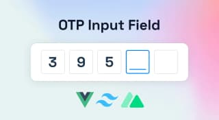
How to make a Reusable OTP Input Field with Vue 3 and Tailwind CSS

An OTP input field is a type of input field used to provide an additional level of security for online transactions. When used in conjunction with a user's existing login credentials, an OTP input field can help to ensure that only the authorized user is able to access their account.
OTP stands for One-Time Password and is typically a 6-digit code that is generated by an authentication app or service. When entering an OTP code into an OTP input field, the user is effectively providing two-factor authentication - something they know (their login credentials) and something they have (the OTP code).
While not foolproof, adding an OTP input field can help to deter would-be hackers and make it more difficult for unauthorized users to gain access to your account.
Now the problem is creating an interactive OTP Field with Vue and Tailwind. I am saying problem because when we create UI, we often forget about the accessibility and functional part. The OTO field should have some functional features apart from the good-looking UI.
Functional Features in an OTP component.
- When we enter a value in any field, the next field should focus. So that we can continue writing the top without using any other keys.
- When we delete any value from the input field, it should also go back to the previous field.
- If the user pastes the code, the component should populate the paste data into input fields.
Implementation
Vue 3 is here! And so is Tailwind CSS. So let's combine the two and build an OTP input field!
Here's what we'll need:
- A Vue 3/ Nuxt 3/ Vue 2 instance
- Tailwind CSS
- Some HTML markup for our input field
First, let's create our Vue 3 instance and include Tailwind CSS:
Create a Vue appyarn create vite my-vue-app --template vue
Add Tailwind CSS for Design
cd my-vue-app
Create Tailwind Config file
npx tailwindcss init -p
Create a CSS file
/* ./src/index.css */
@tailwind base;
@tailwind components;
@tailwind utilities;
Update the main.js file
// src/main.js
import { createApp } from "vue";
import App from "./App.vue";
import "./index.css";

createApp(App).mount("#app");
Now that we have our basic setup let's add some HTML markup for our input field. If you're looking for a quick and easy way to add an OTP input field to your Vue 3 application, look no further than Tailwind CSS. In just a few lines of code, you can have a fully-functional OTP input field that looks great and is easy to use. Here's how to do it.
Create a file
./componenets/OtpInput.vue
Add the markups
<template>
  <div class="otp w-full flex justify-around">
    <input
      ref="firstInputEl"
      type="text"
      maxlength="1"
      class="border rounded w-10 h-10 text-center"
    />
  </div>
</template>
Running the above code will show you a simple div with a single Input field.
Now let's add a prop so that we can reuse the component for different lengths of verification code.
<script lang="ts" setup>
import { ref, watch } from "vue";
const props = defineProps<{ fields: number }>();
const data = ref([]);

const handleOtpInput = (e) => {
  // HANDLE OTP INPUT
};
const handlePaste = (e) => {
  // HANDLE PASTE EVENT
};
</script>
We have defined a props name field this would be used to specify the number of OTP fields. We have also added two functions for handling different events.
Change the template as follows.
<div class="otp w-full flex justify-around" @input="handleOtpInput">
 <template v-for="field in fields" :key="field">
  <input v-model="data[field - 1]" ref="firstInputEl" type="text" maxlength="1" class="border rounded w-10 h-10 text-center" @paste="field === 1 && handlePaste($event)" />
 </template>
</div>
In the above code, we are looping through the fields and creating multiple input fields. In the v-model, we are assigning it to our state variable data
Events
The @input event is added at the wrapper element to listen to all the child elements available inside the wrapper.
We have added the @paste event handler at the first input field so that we can populate all the subsequent fields with the value of the paste event.
Definition of @input event
const handleOtpInput = (e) => {
  if (e.data && e.target.nextElementSibling) {
    e.target.nextElementSibling.focus();
  } else if (e.data == null && e.target.previousElementSibling) {
    e.target.previousElementSibling.focus();
  }
};
In handleOtpInput, we are checking for the input value if that is present and for the Next sibling input fields. If both are true, we are changing the focus to the next sibling input field. Otherwise, we are doing the opposite.
Definition of @paste event
const handlePaste = (e) => {
  const pasteData = e.clipboardData.getData("text");
  let nextEl = firstInputEl.value[0].nextElementSibling;
  for (let i = 1; i < pasteData.length; i++) {
    if (nextEl) {
      data.value[i] = pasteData[i];
      nextEl = nextEl.nextElementSibling;
    }
  }
};
In this event handler, we are looping through the pasted element and adding to our input fields.
We are almost done now the only thing we need to do is send the entered data to the parent component. We do that by emitting an event from the child component. Since it will be reusable and we want the famous two-way binding, v-model we can emit a predefined event name update:modelValue . For Vue 2, use the emit input instead.
Add the watcher and emit the event to the parent.
watch(
  () => data,
  (newVal) => {
    if (
      newVal.value != "" &&
      newVal.value.length === props.fields &&
      !newVal.value.includes("")
    ) {
      emit("update:modelValue", Number(newVal.value.join("")));
    } else {
      emit("update:modelValue", null);
    }
  },
  { deep: true }
);